Case Study - Service Design at ESFA
What was the overarching problem?
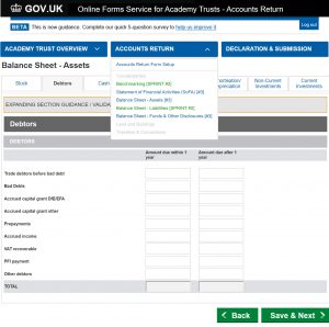
Single-Academy and Multi-Academy Trusts are required to submit an annual accounts return – the existing online form product to do this was outdated, not user-centric, difficult and timely to use, and not positioned as a .GOV service.
Where did our problem sit in the wider business problems?
Academy Trusts
Single-Academy Trust (SAT) and Multi-Academy Trust (MAT) users need to submit their annual accounts return in a faster, simpler, cheaper way
Stakeholder Data Users
Need to access returns data cleansed via validation and verification to generate useful data assets for the business and other stakeholders
The Government
Needs to generate qualified accounts for the Academy sector that can be ‘scrutinised’ as required by Parliamentary activities
How did we define our problem boundary in the big picture?
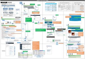
The Big Picture Sketch
Onset of discovery phase the business/system analysts and I drew the big picture on a whiteboard – to gain complexity of the wider business problems, the system extent and our product/service position and impact within (blue boundary)
From this I could identify the critical and wider users (user symbols in blue/red)
and those in our project/product scope
The Big Picture Formalised
Once the team agreed the sketch was a fair initial representation of the system extent and our product/service role within (blue box) I formalised this in visio in order that we could iterate with new findings
*images are project artefacts intentionally obscured for client/data privacy
Who was in the project team of 16?
Delivery Manager
1
Product Owner
1
User Researcher/Service Designer
1 (Me)
Business/
System Analysts
3
Subject Matter Expers
2
Agile Developer Lead
1
UX
Developer
1
Product Developers
4
Testers
2
Who were the users of the online form product?
Given some users acted as more than one user type, I segmented into user groups based on user type when using the product:
User Group 1
Notifyee
Receive email to say return is due
Accounting Officer | cc Chief Financial Officer
User Group 2
Super User
Create user accounts
| Setup user groups 3-5
Accounting Officer | Chief Financial Officer
User Group 3
Preparer
Complete accounts return form – data entry
Bursar | Accounting Officer
(Internal or External)
User Group 4
Approver
Approve the data entry (different user to preparer)
Bursar | Accounting Officer(Internal or External)
User Group 5
Auditor
Audit approved accounts
External Auditor
Other users of the online form product and wider online form service were unclear in early stages of discovery and were further defined during the course of the discovery phase as outlined below.
What was the product/service scope - end-to-end user journey?
Through a number of individual interviews, I set to illustrate the high level user journey (from the point users first engaged with (touched) our product to the point they left) – this highlighted touchpoints on a number of other products – a service design approach was required.
*images are project artefacts intentionally obscured for client/data privacy
Further products to provide the end-to-end accounts return service
The high level user journey identified the following further products (therefore product owners as stakeholders) and users:
Identity and Access Management System (IDAMS)
– for registration/sign in
o Administrators
.GOV Online Guidance and Handbooks
– to assist with form completion
o .GOV Administrators
Service Now
– for email and telephone support
o Service Desk Advisers
Additional products with service expansion
In the alpha project phase (during prototype development) Trusts were requested to complete additional returns to the Accounts Return (AR) which fell into our scope:
Budget Forecast
Return (BFR)
Land and Buildings
Return (LBR)
Financial
Statement (FS)
These products were too being independently developed, had separate product owners and were inconsistent in format, .GOV service positioning and user experience.
I recommended a ‘single sign-on’ dashboard design for users with the .GOV standard style throughout.
What were the user needs?
What were the research methods to capture needs?
Individual Interviews, an Expert Review and Workshops were deemed the most appropriate methods, as outlined below:
Individual Interviews
Since in-depth knowledge was required from a number of experts this semi-structured method enabled gathering of insights/needs from:
o IDAMS Administratorso Service Desk Adviserso Product Owners o Subject Matter Experts o Stakeholders o End Users
Expert Review
Insights from interviews confirmed findings from my expert review as to user’s pain points when attempting to complete the return/form:
o Inconsistent user journey/terminology
o Errors made were not apparent
o Menus on the form were not minimal – up to 50% of the screen in places
o Inline help/guides were not useful or well placed
Most aligned with Neilsen’s 10 usability principles
Working Group Workshops
Once screen design changes were in place to accommodate user needs, the prototype was demonstrated to the Academy Trust Working Group on a two weekly basis.
This allowed users to:
o Agree they were happy with changes
o Request further changes (many made in situ)
o Propose enhancements
This continued until users were happy with the new screen designs
Illustrating and delivering user needs
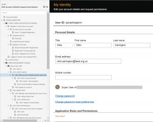
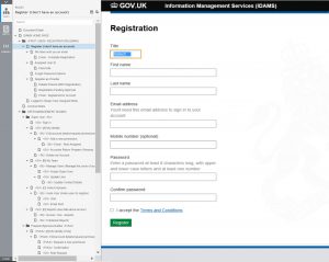
Online form product – registration and access
User Journeys
Since users were struggling most with the registration/sign in and assignment of user roles process, I illustrated the complex user journey for this in order that the pain points could be highlighted and resolved:
Super User - User Journey
Preparer - Approver User Journey
Prototypes
Once the process had been agreed, I initially produced a high-fidelity prototype in Axure to highlight the inconsistent product branding in the user journey.
The prototype was revised, once it was agreed on changes that could be made to convert these products to .GOV branding, to replicate final screen design.
Online form product – accounts return completion
User Journeys
User Journeys were not created for the form completion, given this was, what should be, a fairly straightforward form filling process. Focus was with the form interaction and layout – the screen design – as this is where users were struggling most.Prototypes
I produced a low fidelity interactive wireframe prototype using Axure, since rapid iterative testing, evaluation and iteration was required during workshops. Once wireframe layout was agreed this became high fidelity, to include .GOV branding i.e. it was built to exactly replicate the final screen designs and was used to agree sign-off of the screens by all product owners and stakeholders.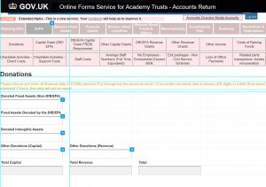
How did we accommodate the additional products?
I created additional wireframe prototypes to position an Academy Trusts return .Gov service – a single-sign-on dashboard where Trusts could access all their returns.
Academy Trusts Service
Our product positioned as a part of a service for Academy Trusts to complete all returns
Academy Trust Service Dashboard
Dashboard proposal inline with .GOV standard
Land and Buildings Return
I spent as much time as possible working with the other product owners to create consistent .GOV branding and ensure the best usability of the other products
How was it built?
Once the prototype was signed off (agreed upon) by all members of the team, stakeholders and users it was passed to the development team to build. The form was built in sections and after each sprint development was user tested by the working group.
High level user needs were initially gathered for each section of the form
Detailed user needs gathered in excel and categorised as to product (e.g. IDAMS, AR Form) and product section (e.g. UI, Support)
User needs were converted to user stories, prioritised and transferred to the jira product backlog for the development team to manage and build
[Mixture of Agile and Traditional Waterfall PM Methods]
- Copyright Users First Ltd 2026